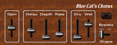
This chapter will teach you how to use sliders in your skins.
Sample 1
In this sample we have just replaced the knobs by sliders, changed the background image and modified the layout a little bit:
This skin has the following points of interest:
-
The presence of the slider_small_selected.bmp image in the folder is automatically detected (it is the same name as for the image (image="slider_small.bmp") with the '_selected' suffix). This is the image used for the slider when selected (the red gradient that you can see on the 'Wet' parameter on the screen shot)
-
The thumb uses an highlighted image when the mouse is over or when it has focus (thumb_image="slider_thumb.bmp" thumb_image_focus="slider_thumb_hi.bmp"
-
The horizontal slider for the shape parameter is not symmetric because of the waveform signs on top, so the v_center="20" statement tells the skin engine that the center of the channel in the slider_h_wav.bmp image is vertically positioned at 20 number of pixels from the top. This allows the skin engine to center the thumb at the correct location.
Sample 2
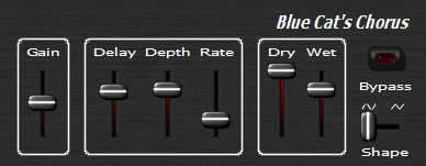
Just the same sample as sample 1, but with another background image:
Sample 3
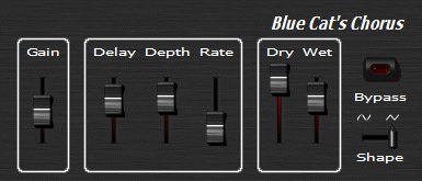
If we now change the thumb image for another one, we need to modify the sliders attributes a little bit to make them match:
-
In this example, the vertical slider thumb uses totally asymmetric images because of the shadow, so we need to specify the position of the center in the image with thumb_h_center="8" thumb_v_center="13". You can also create larger images with blank space on the top and left to compensate the shadow space on the bottom and right to avoid to have to add these attributes.
You may think that the skin code is now looking a bit large, and that you repeat the same statements a lot. You will learn in next chapter how to simplify your skins and reuse your own defined widgets.


