Active element that displays an image depending on the value of the parameter. Its is as an animation or 'filmstrip' for which the image is chosen depending on the value of the parameter: if the parameter value is equal to its minimum the first image is displayed. If the parameter value is equal to its maximum, the last image is displayed. The control supports several keyboard shortcuts and mouse dragging. For more information, see User Experience.
See Attributes Common to Param Controls.
| Name | Value Type | Default Value | Description | Comment | V. | Exp. |
|---|---|---|---|---|---|---|
| Images | ||||||
|
image |
empty |
Image file containing the list of images to display. |
It is a single image containing a 'film strip' with many images. It can be vertical or horizontal, see the image_orientation attribute. |
1.0 |
No | |
|
image_mask |
'image' value with '_mask' postfix |
Path to the alpha mask for previous image. |
This value is optional since by default it is generated from 'image'. |
1.0 |
No | |
|
image_disabled |
'image' value with '_disabled' postfix |
Image file containing the list of images to display when the control is disabled |
This value is optional since by default it is generated from 'image'. |
1.0 |
No | |
|
image_disabled_mask |
'image_disabled' value with '_mask' postfix |
Path to alpha mask for previous image |
This value is optional since by default it is generated from 'image'. |
1.0 |
No | |
|
image_hover |
'image' value with '_hover' postfix |
Image file containing the list of images to display when the mouse is over |
This value is optional since by default it is generated from 'image'. |
1.0 |
No | |
|
image_hover_mask |
'image_hover' value with '_mask' postfix |
Path to alpha mask for previous image |
This value is optional since by default it is generated from 'image'. |
1.0 |
No | |
|
image_focus |
'image' value with '_focus' postfix |
Image file containing the list of images to display when the control has focus |
This value is optional since by default it is generated from 'image'. |
1.0 |
No | |
|
image_focus_mask |
'image_focus' value with '_mask' postfix |
Path to alpha mask for previous image |
This value is optional since by default it is generated from 'image'. |
1.0 |
No | |
|
image_pushed |
'image' value with '_focus' postfix |
Image file containing the list of images to display when the mouse is down over the control |
This value is optional since by default it is generated from 'image'. |
1.0 |
No | |
|
image_pushed_mask |
'image_focus' value with '_mask' postfix |
Path to alpha mask for previous image |
This value is optional since by default it is generated from 'image'. |
1.0 |
No | |
| Other settings | ||||||
|
images_count |
Positive integer |
0 |
Number of images in the film strips contained in the image files |
All image files must contain the same number of images |
1.0 |
No |
|
image_orientation |
vertical |
Orientation of the image file containing the film strip images |
|
1.0 |
No | |
|
orientation |
vertical |
Orientation of the mouse control for the knob. |
If set to horizontal, the value of the parameter value will vary according to horizontal mouse movements. |
1.0 |
No | |
|
pixel_range |
Positive integer |
40 |
Range of the mouse movements to change the parameter value. |
Use a larger value to improve precision of the mouse and smaller values to reduce the mouse movements necessary to change the parameter value. |
1.0 |
No |
Display a parameter knob without options, not changing its aspect on focus and mouse hover events:
<?xml version="1.0" encoding="utf-8" ?>
<SKIN language_version="1.0" background_image="bg.bmp" repeat="true" h_margin="10" v_margin="10">
	<IMAGE_PARAM_KNOB param_id="dsp.input1" image="knob_black.bmp" images_count="127" image_orientation="horizontal" />
</SKIN>
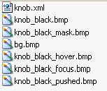
The folder contains:

| |

|
knob_black.bmp: 127 positions of the control |

|
knob_black_mask.bmp:alpha mask for the 127 positions of the control |
The result is:
| (the pictures show the widget for different values of the parameter) | ||
|---|---|---|

| 
| 
|
|
0% |
50% |
100% |
The response curve for the knob can be changed thanks to the 'response_curve' attribute. If set to 'exp1' for example, keeping the exact same files as in previous example, we get:
<?xml version="1.0" encoding="utf-8" ?>
<SKIN language_version="1.0" background_image="bg.bmp" repeat="true" h_margin="10" v_margin="10">
	<IMAGE_PARAM_KNOB param_id="dsp.input1" image="knob_black.bmp" images_count="127" image_orientation="horizontal"
		response_curve="exp1" />
</SKIN>

| 
| 
|
|
0% |
50% |
100% |
Note that the position range for 0 to 50% is larger than the positions range from 50% to 100% : the conversion curve is an exponential function. You thus have more precision for the low values of the parameter.
Using the 'log1' value now for the 'response_curve' attribute, we obtain the inverse result: we have more precision for high values of the parameter:
<?xml version="1.0" encoding="utf-8" ?>
<SKIN language_version="1.0" background_image="bg.bmp" repeat="true" h_margin="10" v_margin="10">
	<IMAGE_PARAM_KNOB param_id="dsp.input1" image="knob_black.bmp" images_count="127" image_orientation="horizontal"
		response_curve="log1" />
</SKIN>

| 
| 
|
|
0% |
50% |
100% |
If we darken the knob_black.bmp image and brighten two copies of it for focus, hover and pushed bitmaps (resp. knob_black_focus.bmp and knob_black_hover.bmp and knob_black_pushed.bmp), we obtain a knob which appears brighter when the mouse is over it or when it has keyboard focus without changing the skin file:

| |

| 
|
|
Normal state |
Mouse over, focus and pushed states |
Note: in this case all knob images share the same mask file: knob_black_mask.bmp. There is no need to add a mask file for all images. See the Images section for more details.